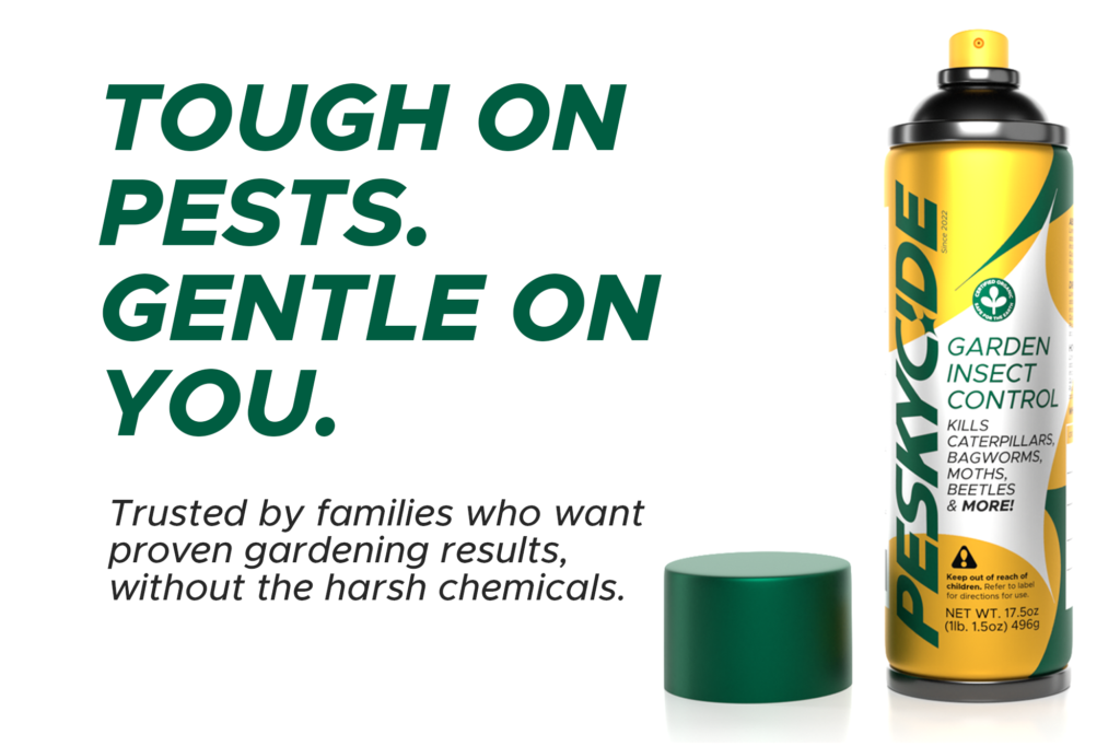
PESKYCIDE looks like a brand that’s been around for dozens of years and just got a refresh. Its mission is to provide high-quality, safe, organic pest control so that families can enjoy their yards – not the bugs.
PESKYCIDE has elements of playfulness in its logo, mascots, and occasionally tone, but it should always have a core “character” that is down-to-Earth, strong, protective, and trusted to get the job done. Goal is to be a young-er looking brand to capture additional demographics, but retain existing older customers who prioritize function over form.
Erin Bushnell: Art direction, brand design & strategy, packaging, logo design, ad concept design and layout, copy, mockups, production design Stephan Dartevelle: 3D models & renders Photography from Shutterstock. PESKYCIDE is a fictional brand concept developed by Erin Bushnell.
Some of my notes as I developed the branding for this fictional company:
– Straddle the divide between conscious-minded consumers who prioritize organic, fair-trade products AND those who just want a tried-and-true product to use. – Modern, but classic – should look like an older brand that got a refresh. Evoke dependability with block letters that feel “strong” and “sensible”. – Captain Jack’s garden products and Dave’s Killer Bread do this well. They feel fresh and wholesome, but not “girly”. They use bright colors, unique hand-lettering, and proudly identify themselves as organic items. They still have a lot of cross-gender and cross-priority appeal because they use a masculine mascot/icon and name, bold stocky lettering and type, and their packaging feels appealing but no-nonsense.
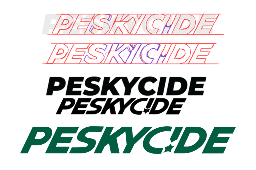
As I developed the logo, I realized that the “Peskycide burst” (the inverted dot on the “i”, invoking an explosive spray of product) had potential as a brand motif. I went on to use it in the packaging to create a dynamic, colorful design.
Why yellow and green? I looked at existing products in both pure pesticide spaces and in organic/gardening spaces, and found yellow consistently used to evoke danger (for the bugs!) and green used to signify gardening and organic products. Combining both makes the product at home in its niche and subconsciously informs the customer. Yellow was chosen as the main background color in the packaging to signal greater strength/danger to efficiency-minded customers.